Advanced Interaction Design
Under Scott Klemmer's guidance, in this course we studied current interaction trends, discussed functions and features, and explored designing across multiple platforms.
Timeline
Sept - Dec 2015
Goals
- Participate in group discussions and feedback sessions
- Create prototype interfaces across platforms, focusing on user specific platform needs
- Choose a company/site to rebrand and iterate designs across mediums
Roles
Graphic design, UI research/design
Cognitive Science Department
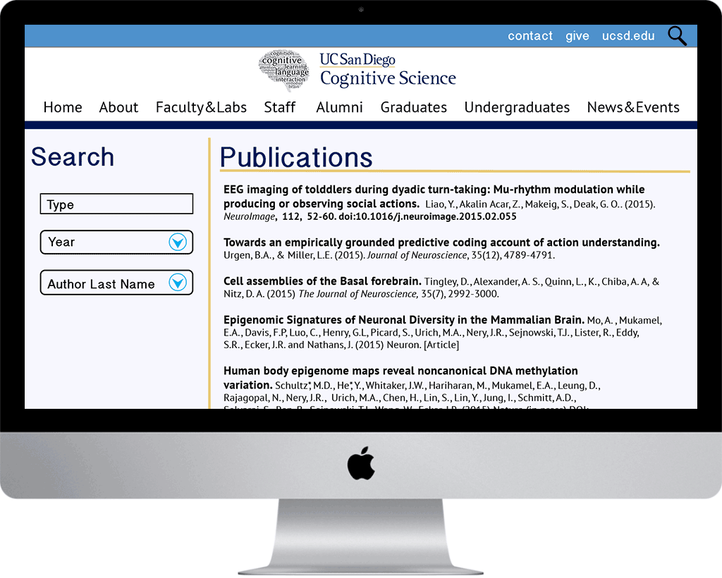
As a passionate student in the Cog Sci department at UCSD, I visited the department website regularly to check course catalog, navigate to professor websites, and look for news and events. At the time of this course, the website was outdated and for some reason, very orange and gray (it has since been redone and looks great). I chose to prototype designs for the Cog Sci department throughout this course.
Desktop
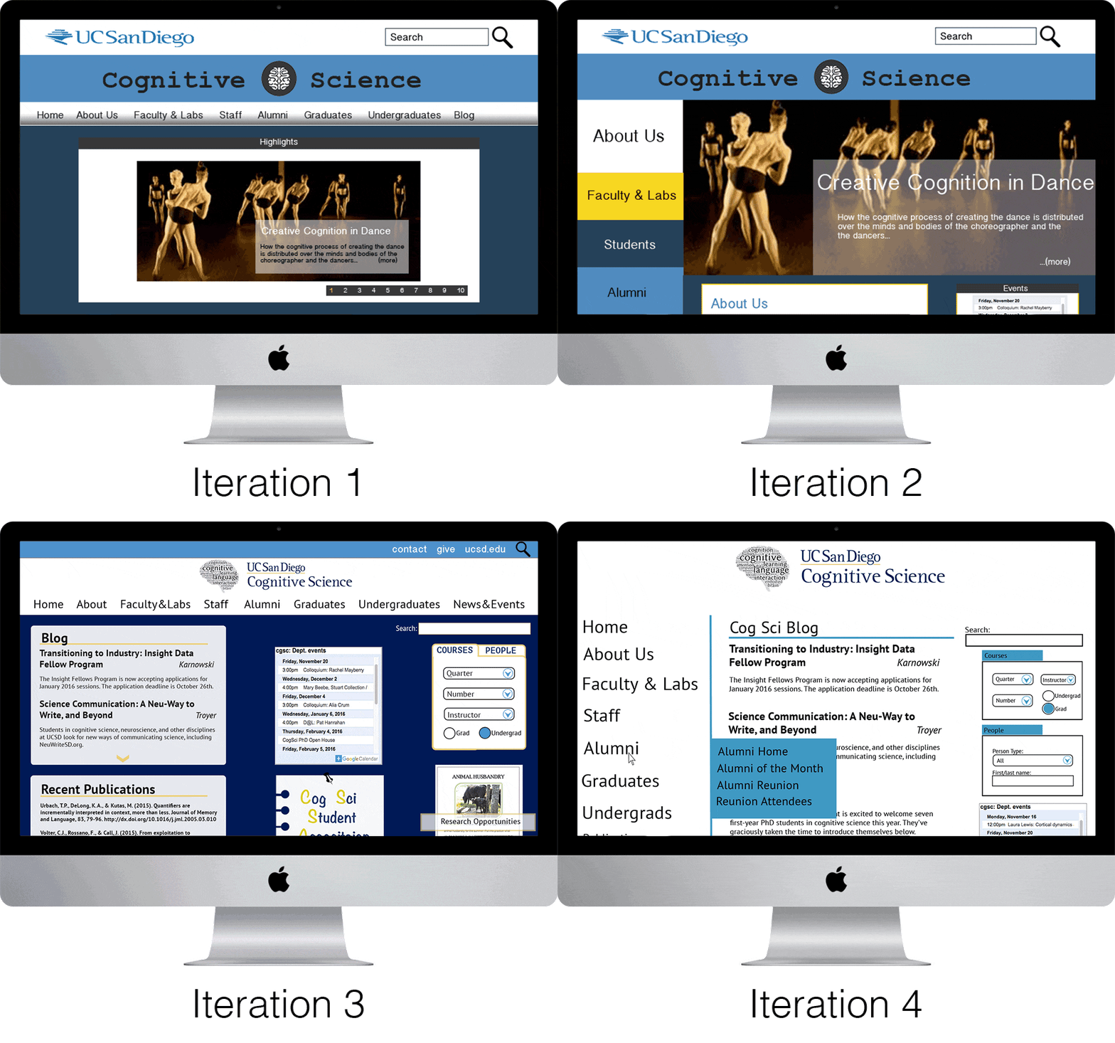
We started off designing for what we know best: desktop. We went through several iterations of this, receiving weekly informal peer and professor feedback in discussions to develop a sense of brand and identity.
Mobile
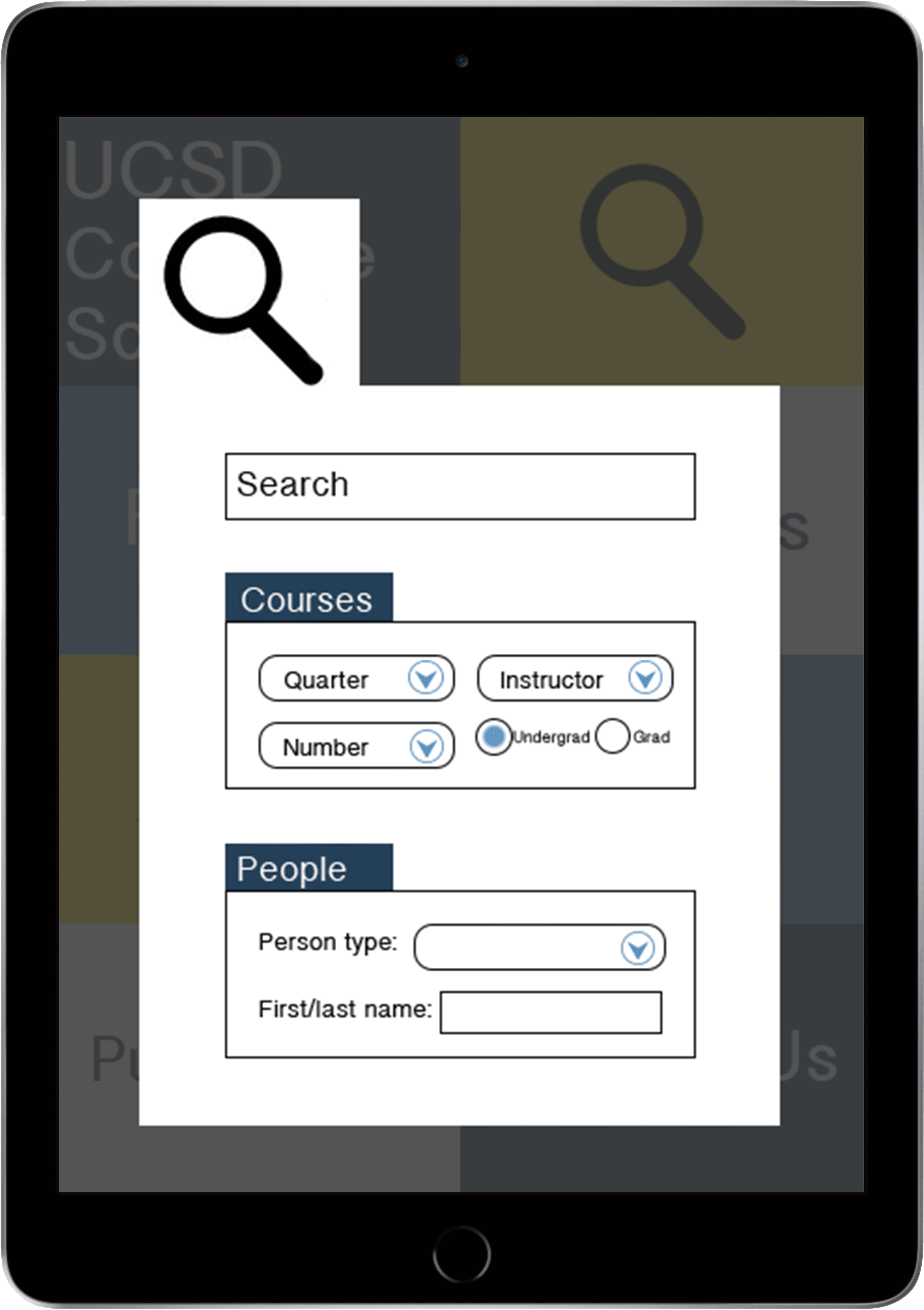
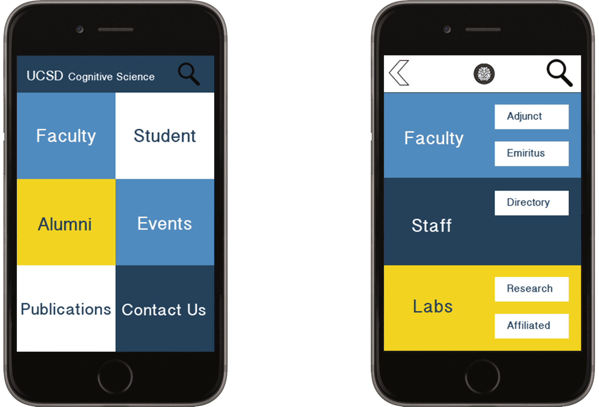
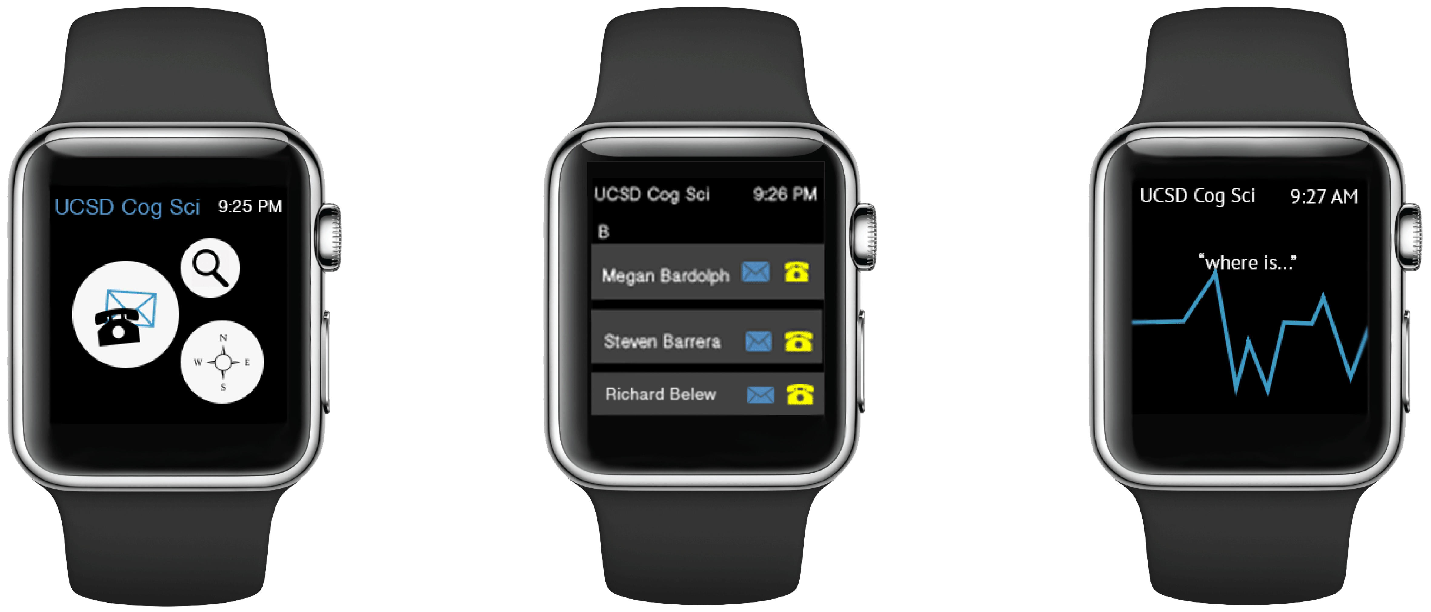
We then started designing for a spectrum of screen sizes, going from tablets and phones down to the small 272 x 340 ppi of an Apple Watch. The goal was to consider user needs, specific to the platform. For these assignments, it was important to ask questions such as: in what situations would a user be accessing this site on this platform? or what information would a user want from this site on this platform? For example, a user accessing the Cog Sci department app from an Apple Watch, is not likely to want the course catalog, but they may be trying to contact someone in the department or find a specific room/office. It is important then, to prioritize this information based on the medium and user situation.
Interactive Display
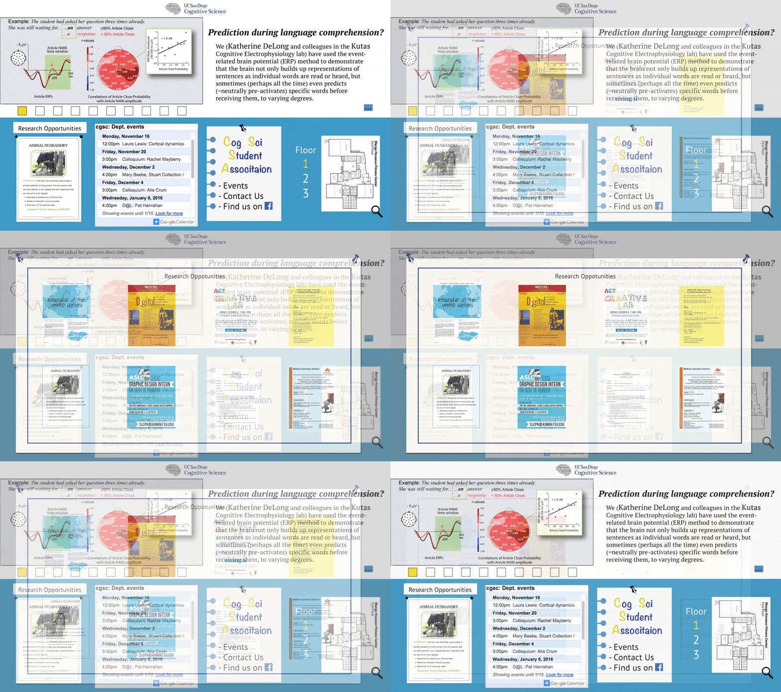
We then went to the other end of the spectrum; we designed for large interactive display boards. The excessive amount of time I had already spent in the Cog Sci building on campus told me that the main users of this board would be students and faculty (we don't get many any visitors touring the building). What kind of information would the passing student or professor want? Quick department news/events updates, Cog Sci Association promotion, and a map (because it can be a rather confusing building to navigate). I prototyped an additional research opportunities feature to list all flyers in one location.
