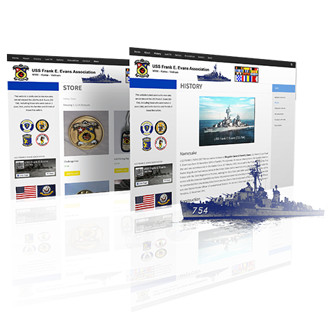
Association Website Redesign
The USS Frank E. Evans Association (FEE) is a Navy association community devoted to remembering the soliders lost in the destruction of the USS Frank E. Evans destroyer. I redesigned their website.
Timeline
Feb 2019 - July 2019
Goals
- Update the Association's website overall look and functionality
- Make new website accessible to the Association's largely senior population (>60 y.o.)
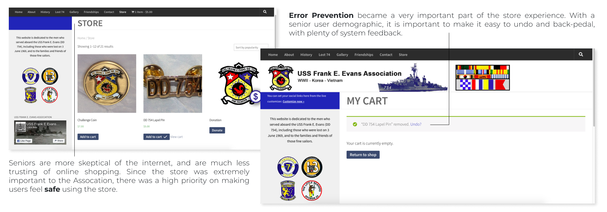
- Build a website store that lessens the work load of the Association's board members
Roles
UX Researcher, WordPress Developer/Master
Defining the Problem
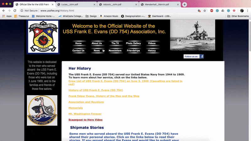
When Association President Steve approached me about this project, he said that the old website looked "old, outdated, and just plain bad". This meant that I needed to find a way to update the old, without alienating the Association's older population.
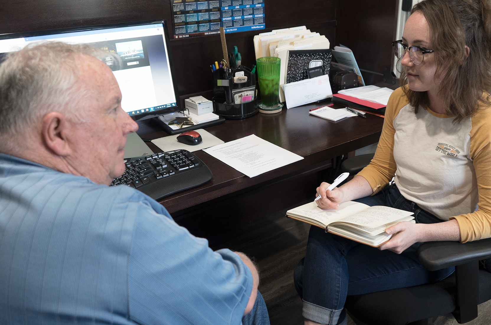
The majority of the Association's members are either survivors of the Vietnam war or the friends and family of the fallen. Their age demographic is largely 60 years or older. I started this project with research first. I read previous user experience studies performed on seniors from industry leaders such as Nielson and Norman Group. I compiled a Senior UX Research Handbook, which I referred to throughout my design process.
Key Insights
After sending out surveys and compiling responses, I learned the top 3 user goals were:
- Finding information on reunions
- Reading newsletters
- Purchasing items in the store
Through my interviews with the Association President Steve and the Treasurer Donna, I learned that two of the above goals were in conflict with the Association's goals.
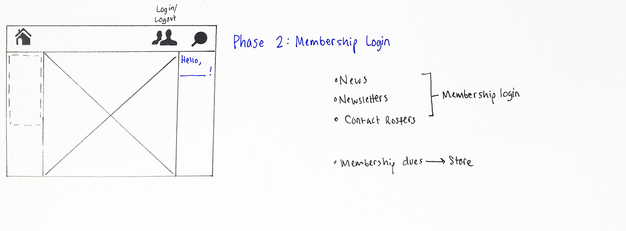
While the Association wanted members to be able to be able to access current news and recent newsletters, they worried that making those readily available on the site would discourage them from paying for Association Membership. A user login and membership functionality was a natural solution to this problem. An added benefit to this solution was that member's could pay their yearly dues through the ship's store, lightening the workload on Association Treasurer Donna: "that would be great, I wouldn't have to hunt down people every year." The Association worried this would be difficult on their senior members though: "It will be too much change at once," Association President Steve worried. "They'll never be able to figure it out and we will be on the phone all day explaining how use it."
Scaffolding
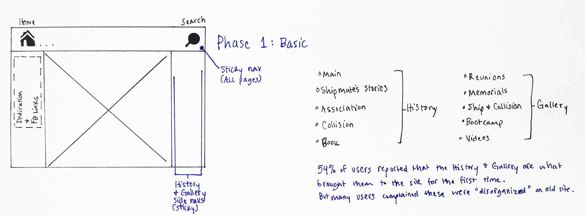
This led to the decision to scaffold the release of the new website into 2 phases:
Phase 1: Release the new website design while keeping the architecture relatively consistent with the old website, allow time for users time to adjust to the new look and store functionality.
Phase 2: Introduce logins and member-only content, accompanied with a tutorial video on the home page, explaining how to login and use the site.
Design Decisions
Challenges
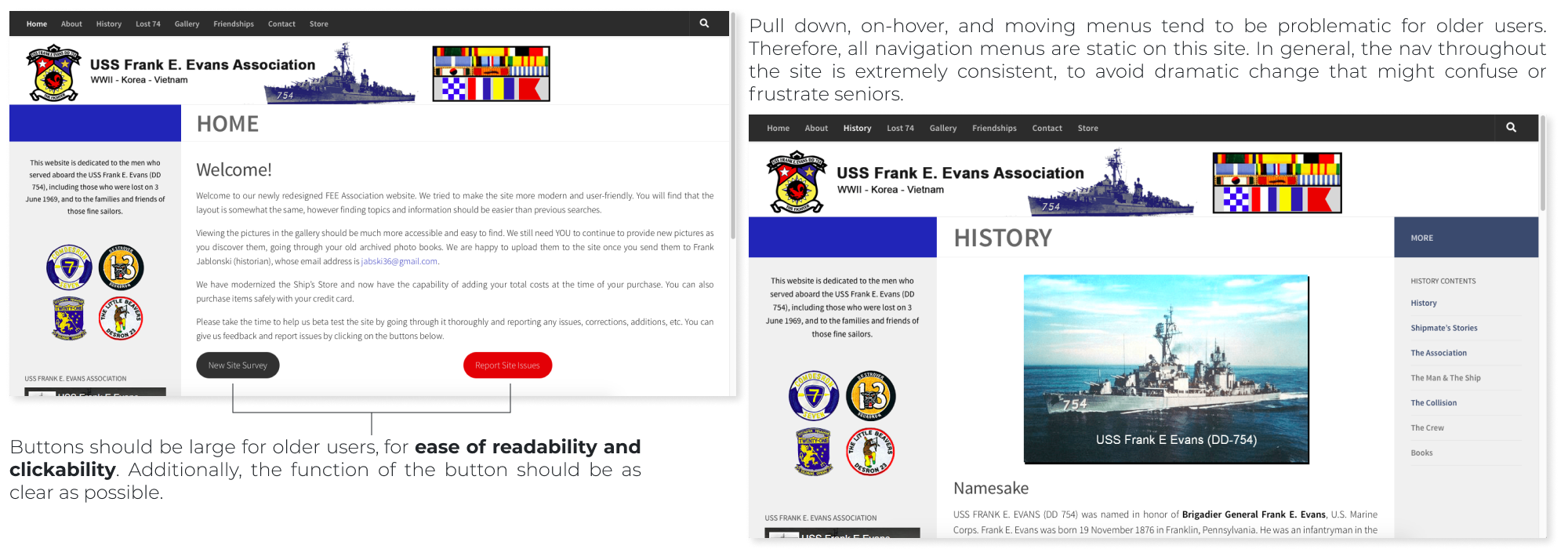
This site was truly a practice in user experience design because while it is tempting as a designer to make something flashy and impressive, that’s not what this site needed to be for its users. Cool and hip web design often makes seniors feel alienated. What you don’t see, was the sacrifice of designer ego, the want to create something beautiful. Instead I focused on the user, which meant stepping away from modern functionality (things like on-hover menus) and reverting back to really basic elements (like sticky header navs and sidebars).